
VHI
Helping Users Help Themselves: A UX/UI Case Study on Vhi’s Support Journey

Design Thinking

3 months

Figma, Miro, Slack, Chat GPT, Google Suite, Notion, Optimal
MY ROLE
I redesigned Vhi’s Help and Support page and navigation to improve information findability and reduce avoidable support demand. Acting as a solo UX/UI designer, I used research-led decision-making, IA, and interactive testing to deliver a clearer, more efficient self-service experience.
THE PROBLEM
Vhi’s Help & Support page was intended to help members quickly self-serve questions, but the experience created friction and frustration.
THE CHALLENGE
Vhi’s Help & Support page allowed users to find answers within a small number of clicks, but task times were high, and confidence was low, especially for less digitally confident members.
Dense cards, poor visual hierarchy, and unclear topic groupings made the content difficult to scan, increasing cognitive load, particularly for members with lower digital confidence.
Users hesitated, overlooked relevant information, or abandoned the journey completely. For Vhi, this resulted in avoidable calls and emails to support teams. The challenge was to redesign the experience to feel simpler, more predictable, and easier to navigate without overwhelming users with increasing content complexity.
THE SOLUTION
Redesigned Vhi’s Help & Support experience to reduce cognitive load and help members find answers faster, especially those with lower digital confidence.
Simplified the information architecture, improved navigation and search, and reduced average task time from 1 minute 41 seconds to under 45 seconds.
THE BRIEF
The existing Help & Support experience created unnecessary friction. Links were not visually distinct, making them difficult to scan, and the cards were overloaded with content, resulting in a cluttered interface. The horizontal layout meant content on the right was frequently overlooked, while long questions were cramped into tight spaces, reducing readability. Topics were not grouped logically, which left users confused and unsure where to look next.
What should have been a quick answer often became a slow, hesitant search. My goal was to simplify the structure, improve scanability, and create a clearer, more predictable experience, particularly for users with lower digital confidence.

THE RESEARCH

CONTEXTUAL ENQUIRIES
INTERVIEWS
SURVEYS
DESK RESEARCH
* testing users age range 20's - 70's
WHAT THE RESEARCH FOUND
Primary The brief outlined several problem areas for both Vhi and its users, which I set out to validate through research. I conducted six user interviews, two surveys, and six usability tests across individual ages 20's-70's, alongside desk research and competitor analysis.
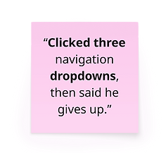
Research confirmed the brief's concerns but also revealed that the core issue wasn't clickdepth, but it was time, confidence, and hesitation. While the users could technically locate information within two clocks, the task times were high, and navigation errors were common. Five of six usability participants struggled to find the Help and Support page, with three abandoning the task entirely. Once on the page, dense content increased cognitive load and caused a drop-off. Based on this, I redefined success from click-based completion to reducing the average time to find information from 1 minute 41 seconds to under 1 minute.


SURVEY SAYS...
How often do you use the Help/Support pages on websites?

Visit Help & Support pages once a year or less
Visit Help & Support pages once a month → a few times a year
Understanding that most people can not recall their last Help & Support page visit, I knew how important clean, simple, familar and predictable patterns were key to improving the experience for users and especially for the less digitally confident users.
The less digitally confident users were set in the brief as a key group to design with in mind. Having looked into some stats for Ireland, Accenture published a report investigating digital confidence in Ireland, and it showed that the over-45s tend to have the lowest confidence in their digital literacy. Feeling ‘below average’ were 44% of 45-54s, 60% of 55-64s, and 70% of over 65s. With a staggering 42% of Irish people describing themselves as also 'below average' in digital skills.
Accenture (2019). Bridging the Gap: Ireland’s Digital Divide
PRIMARY INSIGHT
I CAN'T FIND CLEAR INFORMATION EASILY ... SO I'VE TO CALL FOR QUICK, CLEAR INFORMATION


PERSONA

Mary Murphy
Age: 59
Family: partner + 3 children
Tech confidence: Low → Mid
-
Mary wants to build confidence with less familiar tech and reduce asking her children for help with tech
-
She needs reliable health insurance, consistent technology, and accessible information
She relies on her youngest child to help her with new technology, but feels okay about doing familiar tasks on her own using her laptop. Will call to confirm big or complex tasks to ensure she’s not missed anything.
THE PROBLEM STATEMENT
Mary finds it difficult to locate the Help & Support page and to efficiently find the relevant information once she's there, preventing her from confidently resolving questions on her own.
Design Studio

Design & Iteration
Further Research
Design & Iteration
Voting
MVP
Prototyping
As a solo designer, I used research-backed criteria to guide ideation and reduce personal bias. Each crazy 8 was evaluated against three principles: scanability, reduction of cognitive load, and accessibility for users with lower digital confidence. These principles informed my decisions across navigation, search, and content structure. I introduced these three principles from the brief to use as a voting guide.
To improve findability, I introduced a clear Help Centre CTA in the top navigation, ensuring users could access support without friction. I prioritised a dynamic autocomplete search as the primary interaction, allowing users to bypass unfamiliar site structures entirely. To reduce cognitive overload, I simplified the Help and Support page from 11 to 6 cards, removed secondary links, and regrouped topics based on hybrid card-sorting results. Similarly, on the topic pages, accordions and secondary elements were further simplified to improve scanning and predictability.
My design decisions were informed by NNG's usability research on minimising cognitive load, which emphasises reducing visual clutter, aligning layouts with familiar mental models, and offloading unnecessary decision-making so users can focus on the task that matters.

LOW-FI → HIGH-FI


SOLUTION BUILDING
I added a Help Centre call to action to the top navigation so users can access support more efficiently. I made this update because it now allows users to reach relevant help content with less effort and uncertainty.

Help Centre
I consolidated the Help Centre cards and removed the secondary hyperlinks to reduce visual clutter and improve scanability. The decision to limit the amount of content displayed at once helped lower cognitive load and made available support options easier to understand. Cards were retitled (from the hybrid card sort) to clearly communicate what support is available at a glance.
A pivotal update was the introduction of a dynamic autocomplete search bar dedicated to the Help Centre. It was a winner throughout testing. I chose this to give members a clearer pathway to answers with less time and effort, and without overwhelming them with too many options. It allowed the page to feel logical and easy to use, regardless of digital confidence.

Topic page
The design decision to group the Q&A accordions on the topic pages was to organise the support into clear, logical categories that reflect user needs and to improve readability.

OUTCOME & IMPACT
The improvements of both updating and removing elements were equally impactful to the final design.
Prototype testing showed positive feedback on clarity, structure and ease of use
-
8/8 users were able to find the Help & Support page with no mis-clicks
-
8/8 users were able to find their answer within 1–2 clicks
-
8/8 users were able to find their answer in under 45 seconds
These outcomes support Vhi’s goal of reducing avoidable support calls and emails by enabling faster, efficient self-service.
Measuring Success
Success was initially defined by users locating the correct information within 1–2 clicks. Research revealed this metric was insufficient, as users could complete the task successfully but experienced long task times, hesitation and drop-offs. I redefined success to focus on reducing time to find information and increasing user confidence.
Moving forward, success would be through time-on-task, search interaction data, abandonment rates, and qualitative feedback. Improving these metrics would reduce avoidable support efforts. With more time, I would validate search behaviour at scale and continue iterating on content grouping using live analytics.
Vhi Design Team Response
I presented the final concept and high-fidelity prototype to Vhi’s design team, including designers who had previously worked on this area of the site. The review validated the design direction, particularly the use of predictable patterns to support faster scanning and user confidence. The team also highlighted the clarity of the content structure and the quality of the prototype as effective in communicating both the user experience and the underlying design rationale.
LEARNINGS & NEXT STEPS
The project reinforced the importance of designing for real user behaviour rather than intended user journeys. Simplification, spacing, and predictable patterns had the greatest impact on reducing hesitation and task time for users with lower digital confidence. Removing unnecessary elements proved as valuable as adding new ones.
Next, I would continue validating the search behaviour at scale using analytics and explore personalised support pathways based on user intent. I would also work closely with developers to ensure the use of space and content is more efficient for updates and maintenance.